Simple yet stunning and meaningful geospatial visualization using Happiness and Confict data
With Geopandas, Plotly Express and Folium
In this piece, we will cover how to create stunning (I think 😊) static and interactive geospatial data visualization in Python using Geopandas and other interactive libraries such as Folium and Plotly Express.
Data Introduction
This article uses World Happiness and African Conflict data for the visualization, which comes from two main sources. The World Happiness data was taken from World Happiness Report (WHR) for all the years from 1970 to 2020, which is open data and can be accessed from World Happiness Report [1]. This is a landmark survey of the state of global happiness that ranks 156 countries (number of countries in WHR2020) by how happy their citizens perceive themselves to be. The WHR ranks countries not only by their welfare but also by their citizen’s subjective well-being and digs more deeply into how social, goverment factors affect our happiness.
The African conflict dataset is taken from Armed Conflict Location & Event Data Project, which is publicly available and can be accessed from Data Export Tool ACLED [2]. ACLED contains high-quality and most widely used real-time data sources on political violence, conflicts, and disorder patterns around the world.
The focus of this article will be on geospatial visualization. In a future post, I will write about how to process and prepare data for visualization.
Geo-Spatial Data Visualization
In this section, I will share some of the most popular methods to visualize geospatial data such as using Bubble Map, Multi-Layer Map, Choropleth Map, and the iconic GapMinder Animation. Let us first import some libraries that we need. If you don’t have them yet, please install them.
import pandas as pd
import numpy as np
import plotly.express as px
import geopandas as gpd
from geopandas import GeoDataFrame
from shapely.geometry import Point
from matplotlib import pyplot as plt
import folium
1. Bubble Map
A bubble map uses circle size as an encoding variable. The size of the circle represents a numeric value of a characteristic of a specific geographic coordinate. Let’s learn how to create both static and interactive Bubble Map using Geopandas and Plotly.
Geopandas
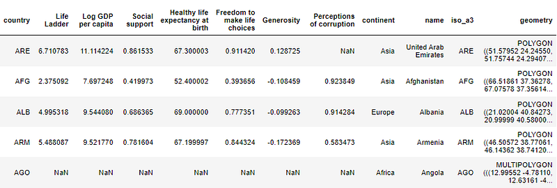
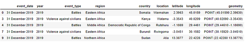
We can easily create a static bubble map with Geopandas. First, the data set WHR we are using contains the Polygon geometry. In order to create bubble maps, we need to create the Point geometry. We can use the property centroidof GeoSeries to generate the geometry points which represent the centroid of each Polygon’s geometry.
gdf_worldhappiness_point = gdf_worldhappiness.copy()
gdf_worldhappiness_point[‘geometry’]= gdf_worldhappiness_point[‘geometry’].centroid
gdf_worldhappiness_2019 = gdf_worldhappiness[gdf_worldhappiness[‘year’]==2019]
gdf_worldhappiness_point_2019 = gdf_worldhappiness_point[gdf_worldhappiness_point[‘year’]==2019]
fig, ax = plt.subplots(figsize=(16,16))
marker = gdf_worldhappiness_point_2019[‘GDP per Capita’]/500
gdf_worldhappiness_2019.plot(ax=ax, color="lightgray”,edgecolor="grey”,
linewidth=0.4)
gdf_worldhappiness_point_2019.plot(ax=ax,color=”#07424A”,
markersize=marker,alpha=0.7, categorical=False,
legend=True plt.axis(‘equal’)
plt.show()
The map below shows a bubble map for GPD per Capita for all the countries in WHR 2019 (note that there is missing data for some countries). The size of the circle represents the GDP per Capita of each country/geographic coordinate of that country. As can be seen, African countries appear to have some of the lowest GDP per capita in the world, with Burundi reported as having the lowest per-capita GDP ever, closely followed by South Sudan and Somalia. A simple but insightful visualization, is not it?
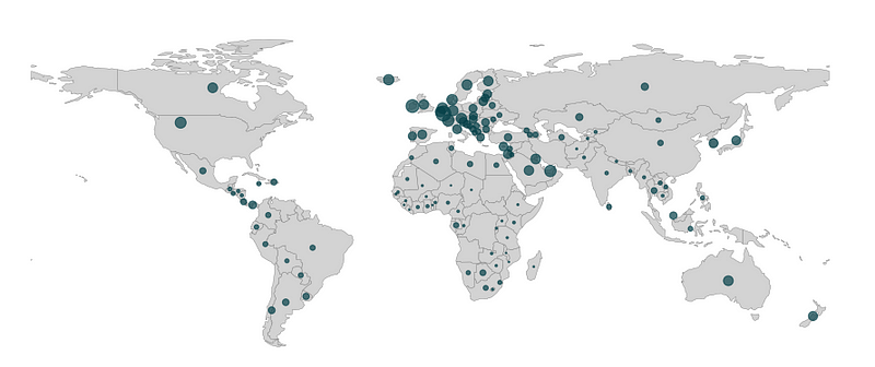
Plotly Scatter Map_box
The bubble map above does its job but it is a static map. To create stunning interactive maps that allow the users to interact with and zoom in on an area of interest, we can build an interactive bubble map.
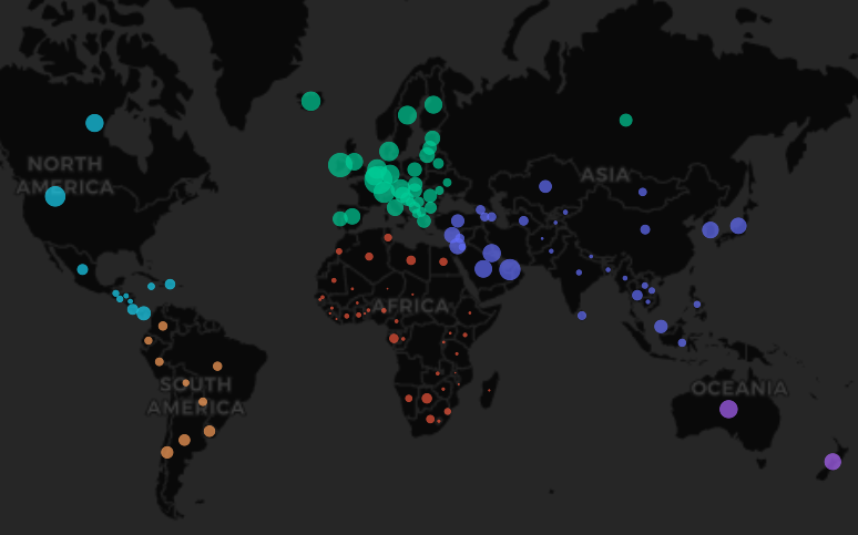
There are different Python libraries for plotting interactive maps. One useful library to construct it is Plotly Express. A few years ago, Plotly, who is well known for Interactive Visualization for R and Python came up with a new library called Plotly Express which has a scatter_mapbox() function that can take a Geodataframe and the column/attribute you want to use for the bubble size to create an interactive Bubble Map.
fig = px.scatter_mapbox
(gdf_worldhappiness_point_2019.dropna(subset = ‘GDP per Capita’),
lat="latitude”,lon="longitude”,color = ‘continent’,
size= ‘GDP per Capita’,
color_continuous_scale=px.colors.cyclical.IceFire,size_max=15,
hover_name = ‘name’,mapbox_style="carto-darkmatter”, zoom=1)
fig.show()
The following interactive graphic provide the same insight as the static Bubble Map but users can now hover over a geometry point location and interact with the map. So, we are doing better, is not it?
2. Multi Layer Maps
We sometimes need to visualize multiple data sets overlaying on top of each other. Let’s see how we can do that with Geopandas and Folium.
Geopandas
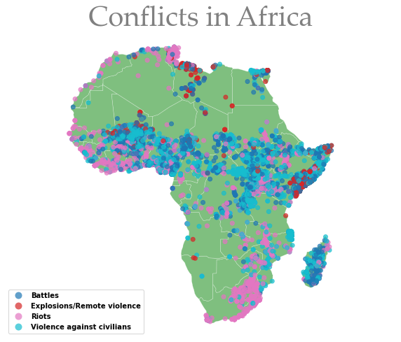
There are several ways to overlay plots. One way to make a map with multiple layers is using Geopandas. plot function. This can plot more than one data set on the same set of axes. Each data set can be added on top of the previous one by adding an extra plot command and passing the axes to the ax keyword. In the following code, I have two data sets: “Africa” and “acled”. “Acled” is plotted on top of the data set “Africa”.
fig, ax = plt.subplots(1,1, figsize=(12,10))
Africa.plot(ax=ax, linewidth=0.5,edgecolor = ‘white’,facecolor = ‘Green’,
alpha=0.5);
acled.plot(ax= ax,column = ‘event_type’,alpha=0.7,legend = ‘event_type’);
plt.title(‘Conflicts in Africa’, fontsize=40,
fontname="Palatino Linotype”, color="grey”)
ax.axis(“off”)
plt.axis(‘equal’)
plt.show()
The plot shows that West Africa is a sub-region with lots of conflicts such as Battles, riots, and violence which makes perfect sense as most of the states there have seen civil wars such as Sierra Leone, Liberia, Guinea-Bissau, and Ivory Coast. Furthermore, all types of conflict seem to be present in some parts of Eastern Africa as well. To my surprise, there seem to be some battles and violence going on in Madagascar. I did not know about this before working with this data set so learning something new.
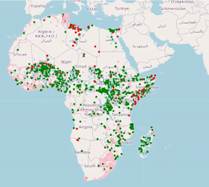
Folium
To allow users to interact with and zoom in on different areas of interest in the conflict map, we can employ Folium, which is a powerful Python library that can create several types of Leaflet maps. To get started, we first create a base map by simply calling folium.Map(). We can then add markers on the top of the base map using CircleMarker, a class for drawing circle overlays on the base map to pinpoint a location using the coordinates information.
fm = folium.Map()
geo_Africa_list = [[point.xy[1][0], point.xy[0][0]] for point in acled.geometry ]
def color_producer(event_type):
if event_type == ‘Battles’:
return ‘lightblue’
elif event_type == ‘Violence against civilians’:
return ‘green’
elif event_type == ‘Riots’:
return ‘pink’
else:
return ‘red’
for i, coordinates in enumerate(geo_Africa_list):
color = color_producer(acled.event_type.iloc[i])
folium.CircleMarker(location = coordinates, color = color, radius = 0.5
,popup = f”{acled.event_type.iloc[i]}”
).add_to(fm)
fm
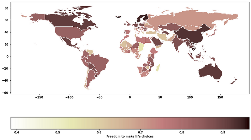
3. Choropleth Map
Choropleth maps are probably the most commonly used geospatial visualization. A choropleth map is a type of thematic map that uses the intensity of color to correspond to a summary of a geographic characteristic within a spatial unit, such as population density or GDP per capita. Again, Geopandas.plot function or Folium.Choropleth() can be employed to create Choropleth map.
gdf_worldhappiness_2019.plot(column = “Freedom to make life choices”,
figsize=(15,10),legend=True, edgecolor="white”,
cmap = ‘pink_r’,
legend_kwds={“label”:“Freedom to make life choices”,
“orientation”:“horizontal”})
My beautiful country Vietnam has gained really high score regarding the Freedom to make life choices. What a nice surprise! I learned a great way to conceptualize development from my Development studies class. It says, “development should be seen as people having the freedom to live the lives they have reasons to value”. This is the national average score responding to the question: “Are you satisfied or dissatisfied with your freedom to choose what you do with your life?”
4. Recreating Gapminder Animation with PlotlyExpress
The Gapminder Animation has been one of the iconic moments of Data Visualization when Hans Rosling presented this stunning Animation in his famous augmented reality animation work and Ted Talk. In this section, we will learn how to recreate a similar iconic Gapminder animation using Plotlyexpress with the following code:
fig = px.scatter(
gdf_worldhappiness_point.dropna(subset = ‘GDP per Capita’),
color = ‘Region Name’,
size= ‘GDP per Capita’,
color_continuous_scale=px.colors.cyclical.IceFire,
animation_frame= “year”,
animation_group="country”,
hover_name = ‘name’,
size_max=35,
x="GDP per Capita”, y="Healthy life expectancy at birth”,
color_discrete_map={“Europe”: ‘rgba(260,0,0,0.4)'},
log_x = True
)
fig.show()
This is pretty simple to implement. The plotly. express module (usually imported as px ) has the function px.scatter()which gets the data from the geodataframe. You then need to define x and y axis along with the animation_frame, animation_groupthat gets incremented every year. With some more arguments for cosmetic improvements, the Animated Bubble Map is here! You now can interact with this map and see how countries’ income and life expectancy have changed in the past 15 years.
Boom, there you have it! Three stunning ways of plotting geospatial data: GeoPandas, Plotly, and Folium. Let me know in the comments what you think :)
Thank you for reading. If you find my post useful and are thinking of becoming a Medium member, you can consider supporting me through this Referred Membership link :) I’ll receive a portion of your membership fee at no extra cost to you. If you decide to do so, thanks a lot!
References
[1] Open data: World Happiness Report Home | The World Happiness Report. Helliwell, John F., Richard Layard, Jeffrey Sachs, and Jan-Emmanuel De Neve, eds. 2020. World Happiness Report 2020. New York: Sustainable Development Solutions Network
[2] Open data: The Armed Conflict Location & Event Data Project ACLED (acleddata.com). Raleigh, Clionadh, Andrew Linke, Håvard Hegre, and Joakim Karlsen. (2010). “Introducing ACLED-Armed Conflict Location and Event Data.” Journal of Peace Research 47(5) 651- 660.
By Lan Chu on May 1, 2022.