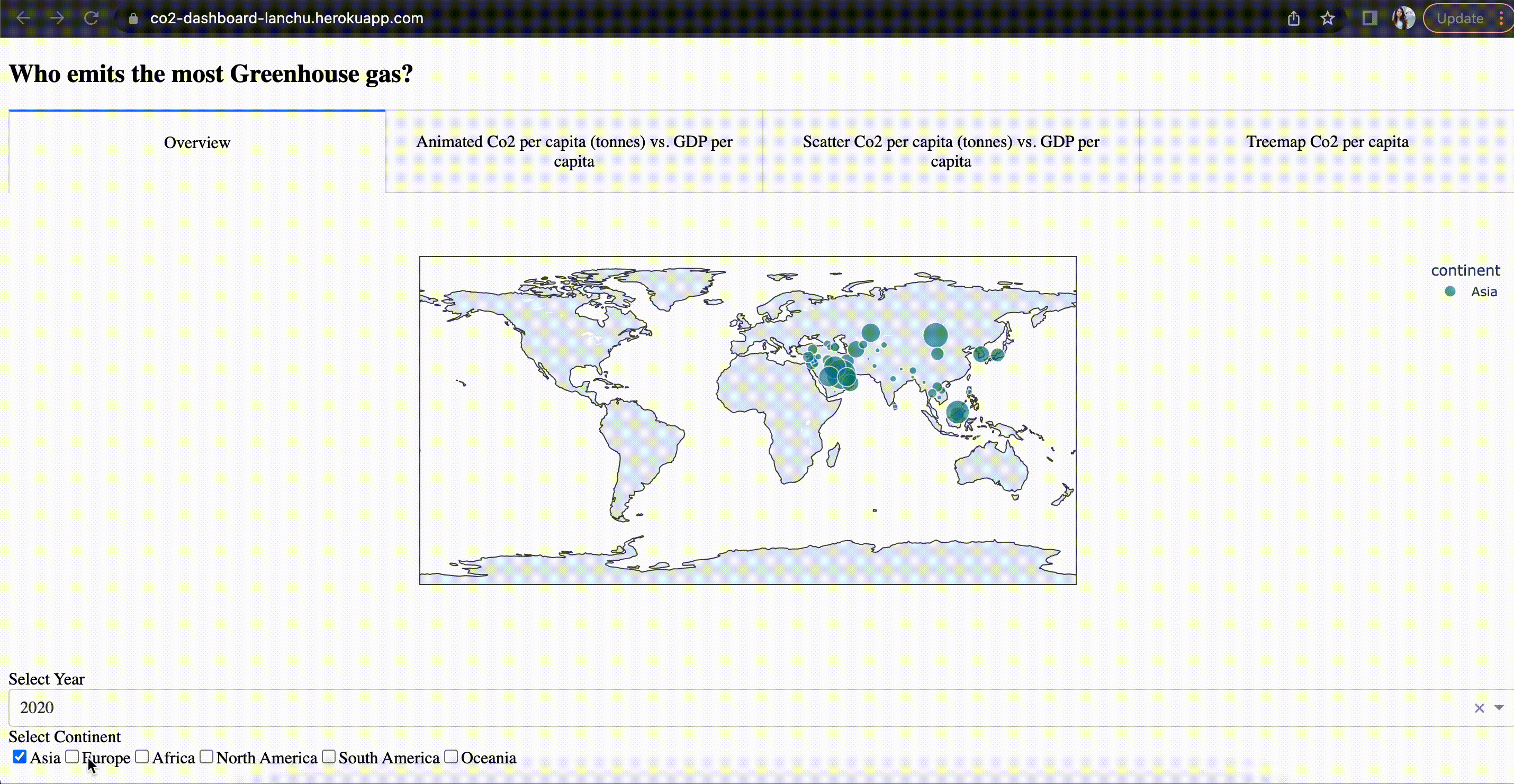
Who emits the most Co2?A treemap animation with Plotly.graph_object
Use Plotly Graph Object to make a treemap with a slider for changing data display.
[Find the code for this article here.]
In this article, we will learn how to visualize hierarchical data with ‘tree map’ visualization using Graph_object module of Plotly library.
Plotly Express vs. Plotly Graph_object
The Plotly Python library is an open-source library for interactive visualization. The Plotly Express module offers a quick and easy implementation as a starting point for creating the most common figures with the simple syntax but lacks functionality and flexibility when it comes to more advanced chart types or customizations.
In contrast to Plotly Express, Plotly Graph Objects (Go) requires more coding but is much more customizable and flexible. Every figure produced with the Plotly library actually uses Graph Objects under the hood, unless manually constructed out of dictionaries.
You could create a treemap using the Plotly Express module in a single function call and with a few lines of code. However, Plotly Express does not provide the ability to add more interactive features like slider animation. In this tutorial, I will show you how to use Go to create the animated treemap with slider animation.
Prepare the data
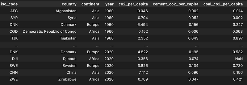
This article uses CO2 emission data from 1947 to 2020, which is open data and can be accessed for free from Our World in Data [1]. The data set contains Greenhouse gas emission attributes such as Co2, methane, nitrous oxide…etc.
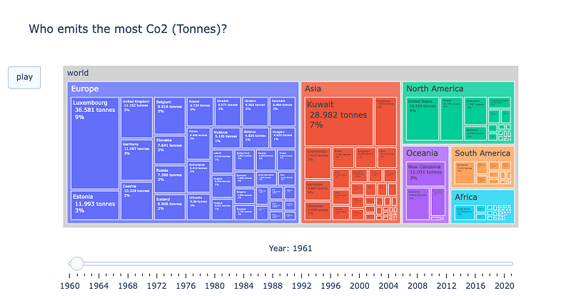
Treemap chart visualizes hierarchical data using nested rectangles. Hierarchical data are often stored as a rectangular data frame, with different columns corresponding to different levels of the hierarchy.
To create a treemap, it is very important to create the data set in the correct hierarchy, otherwise, it will not work. The order starts from the bottom to the top of the hierarchy, the bottom level refers to the “child” and the top level corresponds to the “root parent”.
First, my data set contains the emission per country and per year, let’s call this df_ghg_country. Since each country/child belongs to a continent, the “intermediate parent” of each country will be the continent. So, the “continent” column will be the parent of the child “country” in df_ghg_country. Next, all the continents will make up the “world”. Therefore, at the continent level, the continent will be the child and the “world” will be the “root parent”.
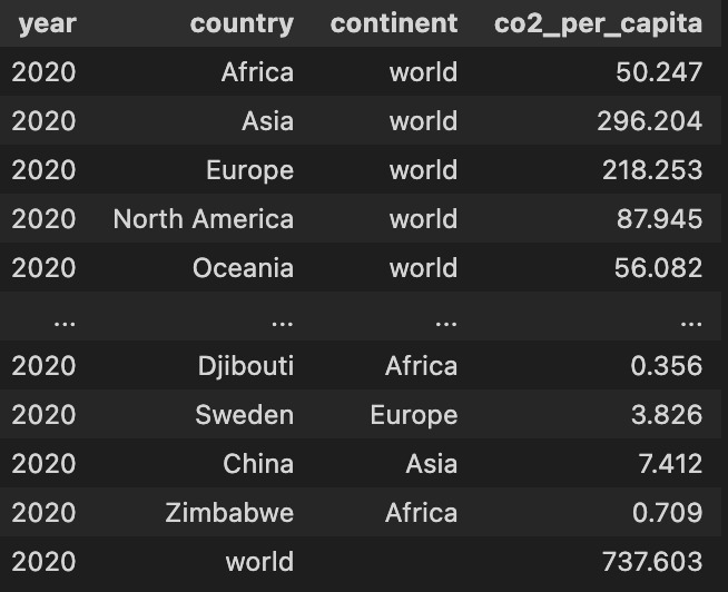
To make the Treemap work, the total value/size of each parent rectangle needs to be equal to the sum of all nested child rectangles. To get the size of each intermediate parent/continent rectangle, sum the values of all its corresponding children/countries. This can be achieved by creating a new data frame to get the total Co2 emission per continent per year. Then, create the parent column in this new data frame which should receive the value “world”. Let’s call this data frame df_ghg_continent. The following code will do the job:
To get the size of the root parent/world rectangle per year, create a new data frame by simply summing the values of all co2 per capita for all countries per year. Let’s call this df_ghg_world. Since the “world” is the ultimate parent itself, it does not have a parent so the parent column for this data set will receive Null values. Creating df_ghg_world can be achieved by the following code:
To make the final data set with all the hierarchies, simply concatenate all the above data frames df_ghg_country, df_ghg_continent, and df_ghg_world. The final data set will look like this:
Create the tree map with slider animation
Make a tree map plot for one year
To make a treemap using Plotly Graph_Objects, we need to use the Go.Figure and, at minimum, provide Plotly Go the following arguments:
- The label of each rectangle
- The size/value of each rectangle: this sets the values associated with each of the rectangles. The value is used to assign sizes of each rectangles.
- The parent
With some more arguments for cosmetic improvements, the animated tree map is here!
Add the slider animation:
Our data is a time series data set. To see how the contribution of each country to global Co2 emission changes over time, we will be adding an animation that automatically moves a slider — which is responsible for changing the data displayed we want to visualize — forward.
We can achieve this using the sliders and the frames parameters in go.layout and go.Figure. By creating a list of frames where each frame corresponds to a Treemap of a specific year, each frame will be shown during the animation one by one. The details steps and code are as follows:
- Use plotly.go to create a list of figures that includes the Treemap for each year in the data.
- Create a list of frames by turning each figure in step 1 into a frame using Plotly.go.frame.
3. Make a list of sliders in which each element in the list is a dictionary of what each slider should look like.
Note that the name that was given to each frame in step 2 should be the same as the one given inside args on line 8 in the above snippet.
4. Create the layout object which is a dictionary where the slider (in step 3) is one parameter, and a play button is included inside the “updatemenus” key
5. Create the figure using Go.figure with Layout and Frames parameters. The Frame (in step 2) is added as a key in a figure object. The frames point to a list of figures, each of which will be cycled through when animation is triggered. The layout object (created in step 4) is passed to the layout constructor in Go.Figure.
You now can interact with this map and see how each country’s contribution to Co2 emission has changed in the past 60 years. The size of each rectangle is proportional to the share of Co2 per capita from a particular country.
There you have it, a stunning animated treemap visualization using Graph_objects module of Plotly. Let me know in the comment what you think!
[1] Open data: Data on CO2 and Greenhouse Gas Emissions by Our World in Data. Access link.
Thank you for reading. If you find my post useful and are thinking of becoming a Medium member, you can consider supporting me through this Referred Membership link :) I’ll receive a portion of your membership fee at no extra cost to you. If you decide to do so, thank you so much!
By Lan Chu on August 16, 2022.